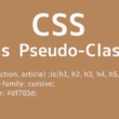
CSSのline-clampプロパティで長い文字テキストを省略する
Webサイトによくあるニュースやお知らせ、ブログ記事投稿の一覧では、見出しの文字テキストが長い場合に、「…」で文字を省略していくこともあります。
文字テキストの省略というと、多くのWebサイトで採用されているWordPressでは、PHPスクリプトのmb_strlen関数で文字列の文字数を取得し、mb_substr関数を使って取得した文字列の一部を返すという方法で文字数制限をかけるのが一般的かと思います。
そのほかJavaScriptでも、substrメソッドを使っていくことで、文字列制限をかけてテキストを省略することができます。
少し手間がかかりそうな文字テキストの省略ですが、CSSのline-clampプロパティを使うことで、CSSのみで長い文字テキストを省略することができます。
line-clampプロパティは、ブロックコンテナのコンテンツを、指定した行数に制限することができるプロパティになります。
以下、Webブラウザのサポート状況です。
Can I Use(line-clamp)
https://caniuse.com/?search=line-clamp
主要ブラウザは問題なく利用できます。
CSSのみで出来れば、プログラミングが苦手の方も、手軽に実装することができます。
これまでのPHPやJavaScriptの方法ですと、文字数で制御するため、可変幅で要素の幅が狭くなれば行数も増え、高さが変化してデザインの調整がしづらいです。レスポンシブWebデザインでは、画面幅でプログラムコードを調整する必要が出てきます。
一方で、CSSのline-clampプロパティは行数で制御しますので、可変幅でもしっかりと指定した行数で省略され、デザインの調整がとても楽です。
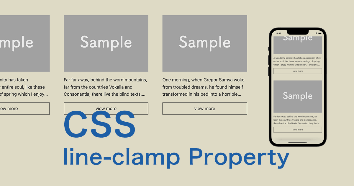
line-clampプロパティを使った長い文字テキストの省略
まずはHTMLから。
サンプルでは、よくある一覧のレイアウトを構築してみました。
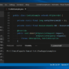
HTML
<section class="s-conts">

  <div class="layout-block">

    <div class="box-conts">
      <p><img src="images/sample01.jpg" alt="sample01"></p>
      <p class="line-clamp">A wonderful serenity has taken possession of my entire soul, like these sweet mornings of spring which I enjoy with my whole heart. I am alone, and feel the charm of existence in this spot, which was created for the bliss of souls like mine.</p>
      <a class="box-btn" href="#">view more</a>
    </div>

    <div class="box-conts">
      <p><img src="images/sample01.jpg" alt="sample02"></p>
      <p class="line-clamp">Far far away, behind the word mountains, far from the countries Vokalia and Consonantia, there live the blind texts. Separated they live in Bookmarksgrove right at the coast of the Semantics, a large language ocean.</p>
      <a class="box-btn" href="#">view more</a>
    </div>

    <div class="box-conts">
      <p><img src="images/sample01.jpg" alt="sample03"></p>
      <p class="line-clamp">One morning, when Gregor Samsa woke from troubled dreams, he found himself transformed in his bed into a horrible vermin. He lay on his armour-like back, and if he lifted his head a little he could see his brown belly, slightly domed and divided by arches into stiff sections. The bedding was hardly.</p>
      <a class="box-btn" href="#">view more</a>
    </div>

  </div>

</section>
続いてはCSS。
よく利用されるFlexboxでの横並びで、メディアクエリで狭い幅では縦並びと、レスポンシブWebデザインにも対応させています。
CSS
body {
  background-color: #ebe6ce;
}

main {
  padding: 0 4%;
}

.s-conts {
  max-width: 1000px;
  margin: 4% auto;
}

.layout-block {
  display: flex;
  justify-content: space-between;
  flex-direction:column;
}

.box-conts {
  padding: 0 0 3rem;
}

.line-clamp {
  margin: 1rem 0;
  display: -webkit-box;
  -webkit-box-orient: vertical;
  -webkit-line-clamp: 3;
  overflow: hidden;
}

.box-btn {
  display: block;
  text-decoration: none;
  text-align: center;
  border: 1px solid #333;
  color: #333;
  padding: 0.5rem;
}

@media screen and (min-width:768px) {

  .layout-block {
    flex-direction: row;
  }

  .box-conts {
    padding: 0;
    flex-basis: 30%;
  }

}
CSSクラス「line-clamp」のセレクタに、プロパティを「-webkit-line-clamp」として、値を「3」として制御する行数を指定します。
まだ、各Webブラウザがline-clampプロパティを拡張機能として実装するようなので、ベンダープレフィックス「-webkit-」を追記する必要があります。
また、一緒にdisplayプロパティを「box」でFlexコンテナボックスとして、box-orientプロパティを「vertical」で要素の配置方向とします。そしてoverflowプロパティも「hidden」とします。おそらくFlexコンテナとしないといけないline-clampプロパティで行数を認識できないのでしょう。
CSS
.line-clamp {
  display: -webkit-box;
  -webkit-box-orient: vertical;
  -webkit-line-clamp: 3;
  overflow: hidden;
}
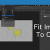
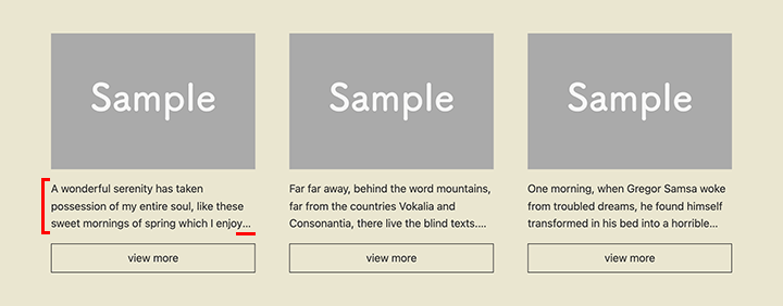
以下、実装結果になります。
動画(3分)
余談
長い文字テキストの省略はもう1つ、text-overflowプロパティでも実装できます。
text-overflowプロパティでは、white-spaceプロパティの値が「nowrap」であったり、overflowプロパティの値が「hidden」である場合に、要素からはみ出た部分を省略できます。
上記でご紹介したline-clampプロパティと違い、行数の制御ができないので、1行の文字テキストで利用していくことになります。
ボタンのデザインなどには利用できるでしょう。
以下、Webブラウザのサポート状況です。
Can I Use(text-overflow)
https://caniuse.com/?search=text-overflow
サンプルとして、文字テキストの短いボタンと長いボタンを用意しました。
まずはHTML。
HTML
<section class="s-conts btn-sample">
  <div class="btn"><a href="">button text</a></div>
  <div class="btn"><a href="">button text button text button text</a></div>
</section>
続いてはCSS。
CSS
.btn {
  text-align: center;
}

.btn a {
  display: inline-block;
  padding: 0.5rem 1rem;
  border: 1px solid #333;
  color: #333;
  text-decoration: none;
  width: 240px;
  white-space: nowrap;
  overflow: hidden;
  text-overflow: ellipsis;
}
「white-space: nowrap;」で開業しないようにして、「overflow: hidden;」で要素の領域を超えたら非表示、そして「text-overflow: ellipsis;」で省略します。
CSS
.btn a {
  width: 240px;
  white-space: nowrap;
  overflow: hidden;
  text-overflow: ellipsis;
}
Flexboxで横並びにする場合は注意が必要で、コンテナ領域の幅をpxで指定する必要があります。
CSS
.btn-sample {
  display: flex;
  justify-content: space-around;
}

.btn {
  text-align: center;
}

.btn a {
  display: inline-block;
  padding: 0.5rem 1rem;
  border: 1px solid #333;
  color: #333;
  text-decoration: none;
  width: 240px; /* Flexboxで横並びの場合は幅をpxに */
  white-space: nowrap;
  overflow: hidden;
  text-overflow: ellipsis;
}
Flexboxでも幅の狭いデバイスで、「flex-direction: column;」と縦並びとしている場合は、幅はパーセントでもOKです。
CSS
.btn-sample {
  display: flex;
  flex-direction: column;
}

.btn {
  text-align: center;
}

.btn a {
  display: inline-block;
  padding: 0.5rem 1rem;
  border: 1px solid #333;
  color: #333;
  text-decoration: none;
  width: 20%; /* Flexboxで縦並びの場合はパーセントでもOK */
  white-space: nowrap;
  overflow: hidden;
  text-overflow: ellipsis;
}
まとめ
JavaScriptやPHPなどのプログラミングで実装しなくても、CSSで手軽に長い文字テキストを省略することができます。
また、文字数での制限ではないので、レスポンシブWebデザインで横並びの要素や、隣接する兄弟要素との高さも揃えることができるので、きれいにレイアウトが調整できるかと思います。
文字を省略したい部分がある時に、ぜひ利用してみてください。


