Flexboxの横並び要素のflexアイテムの見た目の高さを調整する
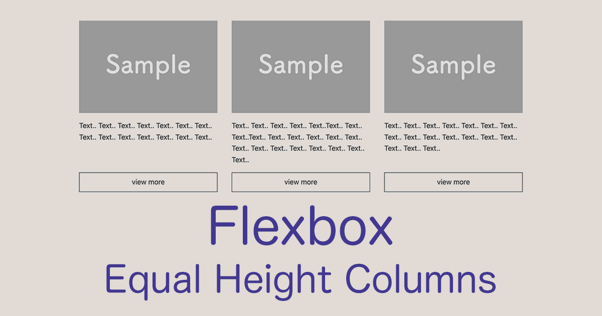
CSSのレイアウト構築で便利なFlexbox。とくに横並びのレイアウトではよく利用され、横並びになった要素同士も高さが揃ってくれます。
しかし、コンテンツの量の違いで、横並びの要素とコンテンツの高さと見た目が揃わないこともあります。
Webデザインではコンテンツ量が違うことはよくありますし、レスポンシブの対応でも、幅の可変で要素の高さが変化することもあります。
横並びとなったflexアイテムの子要素内にも、複数の要素で構築されていると、見た目の高さが揃わないこともあるので、うまく高さを調整していきたいところです。
ここではサンプルを交えて、横並びの要素の見た目の高さを調整する方法をご紹介します。
flexアイテムの高さを調整する
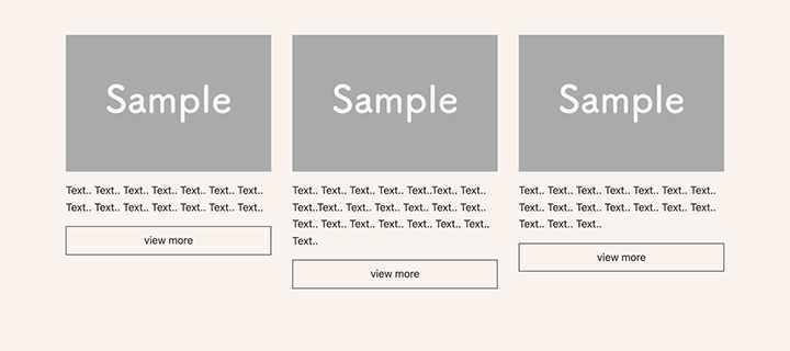
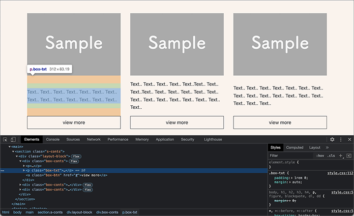
Flexboxの横並びレイアウトの、簡単なサンプルをご用意しました。
まずはHTML。
HTML
<section class="s-conts">

  <div class="layout-block">

    <div class="box-conts">
      <p><img src="images/sample01.jpg" alt="sample01"></p>
      <p class="box-txt">Text.. Text.. Text.. Text.. Text.. Text.. Text.. Text.. Text.. Text.. Text.. Text.. Text.. Text..</p>
      <a class="box-btn" href="#">view more</a>
    </div>

    <div class="box-conts">
      <p><img src="images/sample01.jpg" alt="sample02"></p>
      <p class="box-txt">Text.. Text.. Text.. Text.. Text..Text.. Text.. Text..Text.. Text.. Text.. Text.. Text.. Text.. Text.. Text.. Text.. Text.. Text.. Text.. Text.. Text..</p>
      <a class="box-btn" href="#">view more</a>
    </div>

    <div class="box-conts">
      <p><img src="images/sample01.jpg" alt="sample03"></p>
      <p class="box-txt">Text.. Text.. Text.. Text.. Text.. Text.. Text.. Text.. Text.. Text.. Text.. Text.. Text.. Text.. Text.. Text.. Text..</p>
      <a class="box-btn" href="#">view more</a>
    </div>

  </div>

</section>
layout-blockの親要素の中に、box-contsを子要素として用意。子要素はサムネイル画像とテキスト、リンクという構造です。
続いてはCSSです。
CSS
body {
  background-color: #fcf3ec;
}

main {
  padding: 0 4%;
}

.s-conts {
  max-width: 1000px;
  margin: 4% auto;
}

.layout-block {
  display: flex;
  justify-content: space-between;
  gap: 0 2rem;
  flex-direction:column;
}

.box-conts {
  padding: 0 0 3rem;
}

.box-txt {
  padding: 1rem 0;
}

.box-btn {
  display: block;
  text-decoration: none;
  text-align: center;
  border: 1px solid #333;
  color: #333;
  padding: 0.5rem;
}

@media screen and (min-width:768px) {

  .layout-block {
    flex-direction: row;
  }

  .box-conts {
    padding: 0;
  }

}
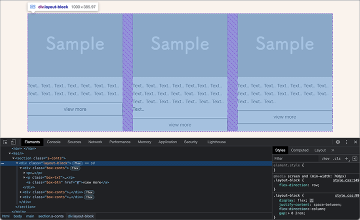
親要素のlayout-blockを「display: flex;」とし、justify-contentプロパティを「space-between」として、flexアイテムの子要素を均等に配置、gapプロパティで余白と「2rem」つけました。
親要素を「display: flex;」とするだけで、子要素はflexアイテムとなり、flex-directionでflexコンテナの主軸の方向を変更しなければ、子要素は横並びになります。
キレイに表示させていくには、横並びの要素の高さを揃えていきたいところ。
ただ、子要素内のコンテンツの量によっては、見た目の高さが揃わないこともあります。
flexアイテムとしては、子要素の高さはしっかりと揃っています。
子要素ないのコンテンツ量に合わせて、横並びの要素と高さを揃える場合は、子要素もflexコンテナとして、子要素内のコンテンツの配置を調整していくことになります。
以下、追加記述箇所です。
CSS
.box-conts {
  display: flex; /* 追加 */
  flex-direction: column; /* 追加 */
  padding: 0 0 3rem;
}

.box-btn {
  display: block;
  text-decoration: none;
  text-align: center;
  border: 1px solid #333;
  color: #333;
  padding: 0.5rem;
  margin-top: auto; /* 追加 */
}
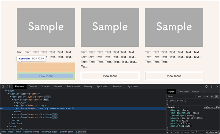
box-conts内は横並びではないので、「display: flex;」とした後に、flex-directionプロパティを「column」と縦方向にします。
justify-contentプロパティをしていしていなければ、上からコンテンツが詰まっていきますが、1番最後のボタン「box-btn」は要素の高さの1番下に配置しますので、box-btnに「margin-top: auto;」とします。
表示を確認すると、ボタンの配置が調整されたのが確認できます。
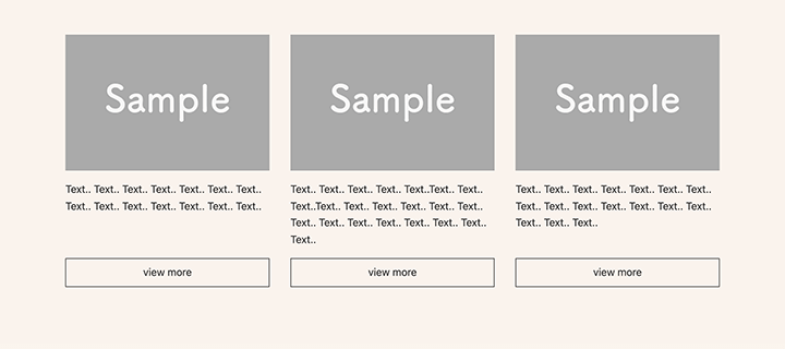
margin-topプロパティを「auto」とすることで、ボタン上の余白を自動で調整してくれるので、要素の1番下に配置されます。
また、コンテンツ内のテキストコンテンツでも、「margin: auto;」などを指定すると、横並びの要素と上下中央で揃えていくこともできます。
要するに、marginで余白を調整することができるということです。
ここまでのコードをまとめたものがこちら。
HTML
<section class="s-conts">

  <div class="layout-block">

    <div class="box-conts">
      <p><img src="images/sample01.jpg" alt="sample01"></p>
      <p class="box-txt">Text.. Text.. Text.. Text.. Text.. Text.. Text.. Text.. Text.. Text.. Text.. Text.. Text.. Text..</p>
      <a class="box-btn" href="#">view more</a>
    </div>

    <div class="box-conts">
      <p><img src="images/sample01.jpg" alt="sample02"></p>
      <p class="box-txt">Text.. Text.. Text.. Text.. Text..Text.. Text.. Text..Text.. Text.. Text.. Text.. Text.. Text.. Text.. Text.. Text.. Text.. Text.. Text.. Text.. Text..</p>
      <a class="box-btn" href="#">view more</a>
    </div>

    <div class="box-conts">
      <p><img src="images/sample01.jpg" alt="sample03"></p>
      <p class="box-txt">Text.. Text.. Text.. Text.. Text.. Text.. Text.. Text.. Text.. Text.. Text.. Text.. Text.. Text.. Text.. Text.. Text..</p>
      <a class="box-btn" href="#">view more</a>
    </div>

  </div>

</section>
CSS
body {
  background-color: #fcf3ec;
}

main {
  padding: 0 4%;
}

.s-conts {
  max-width: 1000px;
  margin: 4% auto;
}

.layout-block {
  display: flex;
  justify-content: space-between;
  gap: 0 2rem;
  flex-direction:column;
}

.box-conts {
  display: flex;
  flex-direction: column;
  padding: 0 0 3rem;
}

.box-txt {
  padding: 1rem 0;
}

.box-btn {
  display: block;
  text-decoration: none;
  text-align: center;
  border: 1px solid #333;
  color: #333;
  padding: 0.5rem;
  margin-top: auto;
}

@media screen and (min-width:768px) {

  .layout-block {
    flex-direction: row;
  }

  .box-conts {
    padding: 0;
  }

}
以下、実際のレイアウトの表示(動き)です。
動画(2分40秒)
Flexboxの概念はレイアウト構築にとても便利です。
flex-directionプロパティでの横並びや縦並び、justify-contentプロパティでの要素の配置や間隔のほか、よく利用するmarginプロパティも使うと、今まで以上に自由にレイアウトが調整することができるでしょう。
また、横並びのレイアウトをCSS Gridで構築することもあるでしょう。
グリッドレイアウトの場合は、subgrid(サブグリッド)を指定することで手軽に要素の高さを揃えることができます。
CSSのsubgridの指定方法については、以下の記事でご紹介しています。
CSS Gridで構築する際はぜひ参考にしてください。

