メインコンテンツより画像や動画のコンテンツ幅を広くするHTMLマークアップとCSS設計
Webページのデザインを作成する中で、見出しや文章のコンテンツに対して、画像や動画をフルスクリーンまたはワイドに表示させるデザインを採用することもあるでしょう。
スマートフォンやタブレット端末でも、画像を大きく表示するほうが、コンテンツに関連する情報として伝えやすくなります。
もちろんそれはPCであっても一緒です。
ここでは、画像や動画をメインコンテンツの幅より広く大きく表示するデザインについて、HTMLマークアップとCSS設計を見ていきます。
複雑な構造で作られているWebページでは、少し難しくはなりますが、ランディングページなどの1カラムで構築するようなシンプルな構造の文書では、手軽にデザインすることができます。
その手軽な方法についてご紹介します。
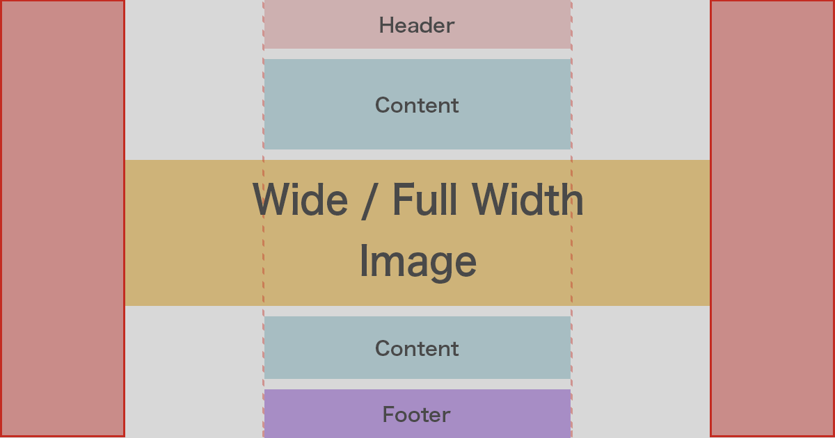
Wide / Full Bleed Layout
まずはHTMLから。
以下のように、article要素のコンテンツはシンプルな構造としています。
HTML
<body>

  <!-- header -->
  <header>
    <div id="header-conts">
      <p>Header</p>
    </div>
  </header>
  <!-- /header -->

  <!-- main -->
  <main>
    <article>
      <h1>Headline</h1>
      <p>Example text... Example text... Example text... Example text... Example text... Example text... Example text... Example text... Example text... </p>
      <p>Example text... Example text... Example text... Example text... Example text... Example text... Example text... Example text... Example text... </p>
      <img src="images/sample.jpg" alt="" loading="lazy">
      <p>Example text... Example text... Example text... Example text... Example text... Example text... Example text... Example text... Example text... </p>
      <p>Example text... Example text... Example text... Example text... Example text... Example text... Example text... Example text... Example text... </p>
      <picture>
        <source type="image/webp" srcset="images/sample.webp"></source>
        <img src="images/sample.jpg" alt="" loading="lazy">
      </picture>
      <p>Example text... Example text... Example text... Example text... Example text... Example text... Example text... Example text... Example text... </p>
      <p>Example text... Example text... Example text... Example text... Example text... Example text... Example text... Example text... Example text... </p>
      <video autoplay loop muted>
        <source src="video/sample.mp4" type="video/mp4"/>
        <source src="video/sample.webm" type="video/webm"/>
      </video>
      <p>Example text... Example text... Example text... Example text... Example text... Example text... Example text... Example text... Example text... </p>
      <p>Example text... Example text... Example text... Example text... Example text... Example text... Example text... Example text... Example text... </p>
    </article>
  </main>
  <!-- /main -->

  <!-- footer -->
  <footer>
    <div id="footer-conts">
      <p>Fooder</p>
    </div>
  </footer>
  <!-- /footer -->

</body>
img要素のほか、画像フォーマットを対応Webブラウザ別用に複数設定できるpicture要素、そして動画を扱うvideo要素と用意しました。
画像と動画、どの要素にも対応できるよう、CSSでスタイルをあてていきます。
CSS
body img,
body video {
  max-width: 1920px;
  width: 100%;
  height: auto;
  display: block;
  margin: auto;
}

article > *:not(img):not(picture):not(video) {
  position: relative;
  max-width: 50rem;
  margin: 2rem auto;
  padding: 0 4%;
}

header,
footer {
  background: #d0d0d0;
  margin: auto;
  padding: 1rem 4%;
}

#header-conts,
#footer-conts {
  position: relative;
  max-width: 50rem;
  margin: auto;
}
img要素やvideo要素のmax-widthを1920pxにしておきました。解像度の高い幅の広い画面では、逆に表示が大きすぎて見にくくなるためです。
そして、1920px以上の幅の場合のレイアウトとして、「display: block;」と「margin: auto;」で中央寄せにします。
article要素の子要素すべてには、max-widhtを設定して中央寄せにします。この時、画像や動画はmax-widthで最大幅を他のコンテンツの幅(max-width: 50rem;)と同じように狭くしたくないので、:not()擬似クラスでimg要素とpicture要素、video要素は除外します。
headerやfooterはフルスクリーンサイズとして、コンテンツ部分はmainコンテンツと同じ幅に調整しています。
他、margin、paddingの微調整となります。
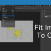
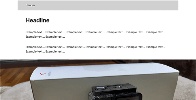
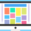
以下、実装結果です。
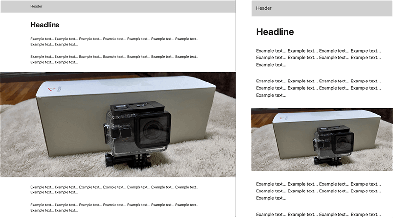
画像や動画でコンテンツの意味や内容を伝えやすくできるデザインとなります。
headerやfooterもメインコンテンツと合わせるのであれば、「header-conts」や「footer-conts」にはスタイルをあてず、headerとfooterに対して「max-width: 50rem;」を指定します。
CSS
body img,
body video {
  max-width: 1920px;
  width: 100%;
  height: auto;
  display: block;
  margin: auto;
}

article > *:not(img):not(picture):not(video),
header,
footer {
  position: relative;
  max-width: 50rem;
  margin: 2rem auto;
  padding: 0 4%;
}

header,
footer {
  background: #d0d0d0;
  max-width: 50rem;
  margin: auto;
  padding: 1rem 4%;
}
複雑な文書構造ですと、もう少しセレクタに対してスタイルをあてて対応しなければいけませんが、1カラムのランディングページなどのシンプルな構造であれば、手軽に画像や動画でコンテンツを広く大きく見せ、違いをつけることができます。
手軽に実装するコツは、:not()擬似クラスをうまく利用することでしょうか。
是非試してみてください。
